ERIC GELBER, assistant editor at artcritical.com, is an artist and critic.
He also contributes to Sculpture, Artnet, New York Sun and other publications.
Denis Farrell Essay, Paintings 1987-2004 by Eric Gelber
(for forthcoming book publication)
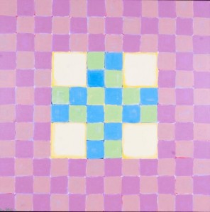
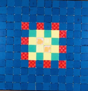
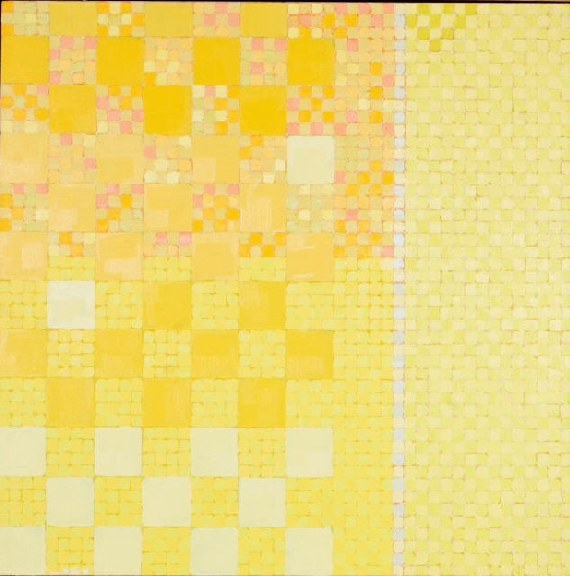
Denis Farrell uses the grid format to focus on what he considers to be essential to the act of painting. He uses the grid to remove all traces of anthropomorphism from the composition. He systematically applies an evenly sized brushstroke to each component of the grid. His grid paintings are filled with mysterious undertones, colors beneath colors mesh with one another and remain transformative color sensations rather than settled tonal values. The grid paintings also generate wonderful overtones, “the color of the light reflected,” off the surfaces of these densely painted metaphors for windows/mirrors. We scan the surfaces of the shallow often textured grids and Farrell counteracts our urge to look into the paintings. This firmly anchors the grid paintings in the material world while at the same time, the coloration suggests the ethereal colors we see when our eyes are closed, those dense flickering walls of color that palpate to the rhythm of the blood coursing through our veins.
Color and space have always been Farrell’s main concerns. “Geometry frees up your imagination.” Inspired by Greek tesserae, the geometric designs found on Greek tiles he studied at the Metropolitan Museum of Art while he lived in New York, Farrell purged his painting of figuration eventually and started to compose grids out of densely layered colors, which bring to mind the various phases of sunrise and sunset and the flora and fauna that surround the artist in his idyllic home on the side of a mountain in Ireland. Farrell relies on the grid form and repetitive application of the pigment to the canvas, to get at what he is most interested in, the drama and psychological complexity found within large fields of modulated color and the weird spaces they suggest. “The grid is composed of one inch squares which are filled with four strokes of color (with a number one short flat brush) until the surface is covered.” By removing figuration from the work, abstract expressionist line and brushwork, and organic abstraction, Farrell’s grid paintings become windows and mirrors. They are redolent of the coloration of the organic world, but they are weirdly other, symbolic of complex subjective states of mind. The grid paintings eliminate the kind of formal struggle we find in abundance in Farrell’s non-grid paintings.
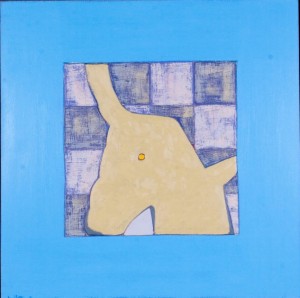
In his early work, done during and immediately following graduate school and modified up until 2004, Farrell turned to modernist geometric-organic abstraction and the urban environment for a way into the process. Before he eliminated spontaneously drawn linear marks from his work Farrell struggled to create a personalized space using the expressive power of complimentary colors. He followed in the modernist tradition of creating otherworldly yet poetically real space using different hues of complimentary colors, and playing line off of modulated patches of color.
While he finished his formal education at the New York Studio School (1989-90) and the Yale University School of Art (1991-93), Denis Farrell searched for an artistic identity, a painterly idiom that was relevant to the times and unencumbered by things he felt were extraneous to the act of painting. Farrell was walking the streets, taking in the ruins of late 1980s New York City, and absorbing the art in all the major cultural institutions and network of galleries. Farrell states that he studied the work of British born painter Frank Auerbach, among others. Auerbach’s crusty swirl of lines and aggressively modulated thick areas of color, especially his paintings of urban structures, come to mind when viewing some of Farrell’s non-grid paintings done from 1987-2004. However, Farrell was not interested in verisimilitude, and his bold use of unmixed primary colors relate his non-grid work more to the geometric abstractions of Hans Hoffmann than to the English painter.


These paintings, experimental byproducts of Farrell’s burgeoning talent, personify the malleability and imaginative potential of geometric forms. The predominant forms in these works are rectangles, triangles, ovoids, organic pod shapes, and free floating and suggestive lines, which hint at such forms as doorways, toppled buildings, construction scaffolding, horizon lines, and aggressive beams of energy. These early paintings are an imaginative and highly charged struggle between horizontal and vertical linear forces. The lines are vehicles for the colors they are painted with. Urban detritus comes to mind when one stares at these heroic struggles for a state of equilibrium between color and line. These paintings have a snap and punch because this balance is never achieved, and the sometimes acidic or perhaps radioactive combination of colors maintains the life force of the work.
A few of these early non-grid paintings are isolated organic blob shapes floating in aqueous or skyey fields of color. The artist did these after he left the urban environment and became immersed in a lush rural setting. The dramatic change of environment left an indelible mark on Farrell’s work. The urban environment inspired him to create compositions filled with an anarchic linear and tonal energy, which keep the viewer’s eyes moving over the surfaces of the paintings in search of an elusive equilibrium. The more formally ordered organic abstractions are theatrical in the sense that isolated forms interact with one another in a more or less clearly delineated space. There are subtle ambiguities in these color fields but they do not disrupt the outlines of the abstract entities.
In the painting Material Image a large irregular rectangular patch of deep orange with white specks hovering across its surface is placed over a large field of silvery blue. Deep red underpainting is still visible beneath the field of blue. Orange specks and dashes, slashes of pale green, red, yellow, mauve, and darker and lighter blue take up the foreground of the bottom and right side of the canvas. Like much of the pre-grid work this painting displays a strong connection to drawing. The linear elements, the drawn shapes, remind us of buildings and fire escapes, but Farrell always remains steadfastly abstract. He has created an agitated surface where complementary colors communicate with one another, and pigments straight out of the tube are juxtaposed with blended mid-tones. Farrell retains a sense of two-dimensionality in the work. The background silver blue, which predominates the composition, is modulated: scratches and creases are pressed into or sliced into it, drips of orange puncture the space it suggests, and the red underpainting quietly hums through its surface. Our eyes are never allowed to sink too far into this imaginative space. Horizontally oriented lines and shapes vie with vertically oriented lines and shapes. Every red, blue, and violet has a green, orange, and yellow counterpart, but nothing perfectly matches up. Every mark is unique. Because these complementary colors aren’t perfectly balanced within the composition some paint strokes, blobs, specks, splashes or smears of color are transient, they reverberate powerfully but also get subsumed into the overall abstract pattern of the work.
The painting Double Genre is less chaotic and more figurative. There is an erect vertically oriented form containing wildly converging lines and dollops of pure and mixed pigment. This shape consists of pale green lines and dashes which resemble a vase or utility pole, a cluster of red daubs of paint above it which form into an inverted triangle, and multiple triangles and right angles in yellow, orange, light brown, and sky blue. By weaving the same light blue that appears in the background into this complex mass, Farrell flattens out space, or makes it difficult to determine what is in front of what. The ambiguity of the spatial relationships between different colors is an important element of Farrell’s later grid paintings. This aggressively erect form is bracketed on the right by a large L-shaped area of reddish purple, which traces the shape of the edge of the canvas. Again the background consists of a thick gray blue with a portal/window like rectangle of lighter sky blue taking up the left side of it. Along the bottom left edge of the canvas there is a shape that resembles the top a skyscraper as seen from below. There is a long gray bar placed behind this shape and another L-shaped form dangles from the top of the gray bar. Along the upper left edge of the picture there is a thick stroke of bright orange paint that communicates with the other slashes of bright orange paint that are placed across the expanse of blue on the other side of the composition. These architectural fragments express the sense of being engulfed or immersed that a walker in the streets of New York City would feel as they look up at the looming verticals.


The painting Red suggests a symbolic interior space with metaphysical implications. The lower third of the painting, multi-colored crisscrossed stripes, acts as a floor in the “room,” and there is a doorway form that merges with the left edge of the canvas. A large field of subtly accented bright, hot red orange takes up two thirds of the painting. A ghostly tilted triangular form is placed in the center of the composition, and there is a red colored cornice like shape resting on it, which is delineated by a faint blue outline. There is a strategically placed blue dot in the field of crusty bright orange in the upper right corner of the painting, and this mighty speck of paint punctures and simultaneously hovers above the orange. As we study the edges of the left side of the painting we realize that beneath the thick orange paint there is a coat of opaque blue. By painting over the blue with a keyed up version of its compliment, and leaving thin traces of the underpainting along the entire ragged left edge of the canvas, the dominant orange field becomes agitated, its strength through majority rule is undermined. This painting is loud and a high level of abstraction is maintained. Farrell’s use of the simple rectangle and triangle leads to complex associations and rich metaphors. In this painting we also see how Farrell plays brushstroke off of daub of paint and smear of paint done with a palette knife. He generates a variety of surface textures by contrasting different modes of paint application and thickening the paint surface through overlap and layering, and this makes the physicality of the canvas palpable.
Fullness of Presence is a tour de force, a gallant struggle to manufacture a complex image without using color descriptively. This wild mesh of lines, triangles, hatchings, and dots of paint is filled with glowing reds and oranges. Yellow ochre, alizarin crimson, dirtied yellows, pale greens, and cobalt blues, hold together agitated mark making, and murky, aqueous triangular portals, suggestive of great mysterious depths. Rather than suggesting a three dimensional space through color and line, Farrell is more interested in layering and foregrounding pure color sensations. The tangled web of diverging and converging lines cancel each other out in the sense that they sate the viewer’s curiosity but never resolve into coherent imagery. Farrell appears to be more interested in the power of juxtaposed colors, the luscious and tactile clump or smear of pigment. The colors are so sensuous and appealing that the lines are little more than a means to an end, a way of putting down color and setting up color relationships, without generating specific imagery that would take away from the expressiveness of the rich colors.
In such paintings as Divergence, Fragment, The Fact of Being Present, and Spectacle Farrell defines a background and foreground plane more clearly. In Fragment two abstract entities are surrounded by an impastoed gray field. Traces of sky blue underpainting emerge mostly along the edges but also in the middle of the painting. Small violet orbs play off of a large smear of bright yellow paint, and a jagged edged block of orange has a crisp thick line of sky blue hugging its entire right edge. These colorful shapes, made up of areas of color rather than individual parts, float in a Miró-esque aqueous and timeless space.
In some of these early works, where there is an emphasis on linear activity, the lines don’t delineate form as much as carry color from one area of the painting to another. That is why the line quality in these early works is thick and pasty. The line does not describe details of form or surface. Lines aggressively bring one color into the territory of another color. Colors clash when lines interact. In the less busy early canvases, Farrell isolates forms more, but the forms are primarily clusters of intense color floating in front of a larger field of complimentary color.
As Rosalind Krauss points out in her seminal essay on grids which first appeared in 1979, “Unlike perspective, the grid does not map the space of a room or a landscape or a group of figures onto the surface of a painting.” Farrell moved away from linear and figural abstractions and began painting his grids so that he could completely remove metaphors for the human body from his work. He realized that even very abstract content would still be read as human figures, familiar structures such as rooms, buildings, and various exterior and interior fixtures, or at the very least symbols for these things. The grid allowed Farrell to introduce a new set of metaphors into his compositions. Following Krauss, Farrell’s grid paintings inspire a centrifugal reading. They appear to be fragments of an infinitely larger fabric of light, energy, and imaginative space. The non-grid paintings that Farrell painted or began to paint before he used the grid format are bold and exploratory. We see Farrell intuitively experimenting with the formal elements of painting in order to discover what is most important to him. 1


